
This is a review of my own old website - the one this site replaced.
Free website review
olxr.co.uk
Rather than invent an example, I ran the same half hour over the old OLXR site that I'd run over yours, and published what came back - including the parts I'm not proud of. It's the fairest way to show you what arrives, and what the tone of it is.
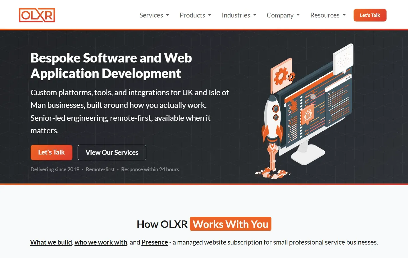
The site olxr.co.uk, OLXR Limited, Douglas, Isle of Man - reviewed on 19 October 2026.
The verdict A capable, well-built site that's trying to say everything at once. It's easy to get in touch and well set up for Google, but a small business owner would struggle to tell in five seconds what OLXR does for them.
What's working
- Getting in touch is easy - Let's Talk is always in view, and the contact form asks for only a name, an email and a few lines.
- The groundwork for Google is done properly: every page checked has its own title and description, and sharing previews are set up.
- It's clearly alive - there's a blog post from July 2026, and the AWS badge links to a page that proves it's genuine.
Three things I'd fix first
- Say what you do for the visitor, in plain English. The headline lists services - “Bespoke Software and Web Application Development” - rather than the problem it solves.
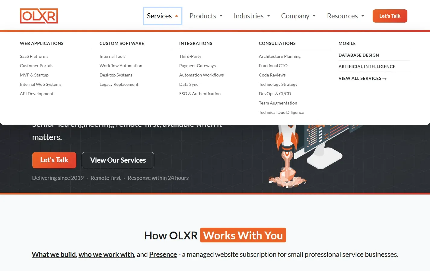
- Cut the menus right down. More than 50 links sit behind five menus, which buries the two things most visitors need.
- Sound like one person, and name your clients. The site says “we” while promising “you'll speak directly with Owen”, and the testimonials have no names.
Scorecard
| Area | Rating | In one line |
|---|---|---|
| First impressions | Clear way to get in touch, unclear what you get | |
| Being found on Google | Titles, descriptions and sharing set up properly | |
| Speed on a phone | 91 on mobile, and full marks on the other three | |
| Housekeeping | A few mixed messages on response times | |
| Content and trust | Strong credentials, anonymous testimonials |
First impressions
A visitor can see how to get in touch straight away, but not what OLXR would do for them.
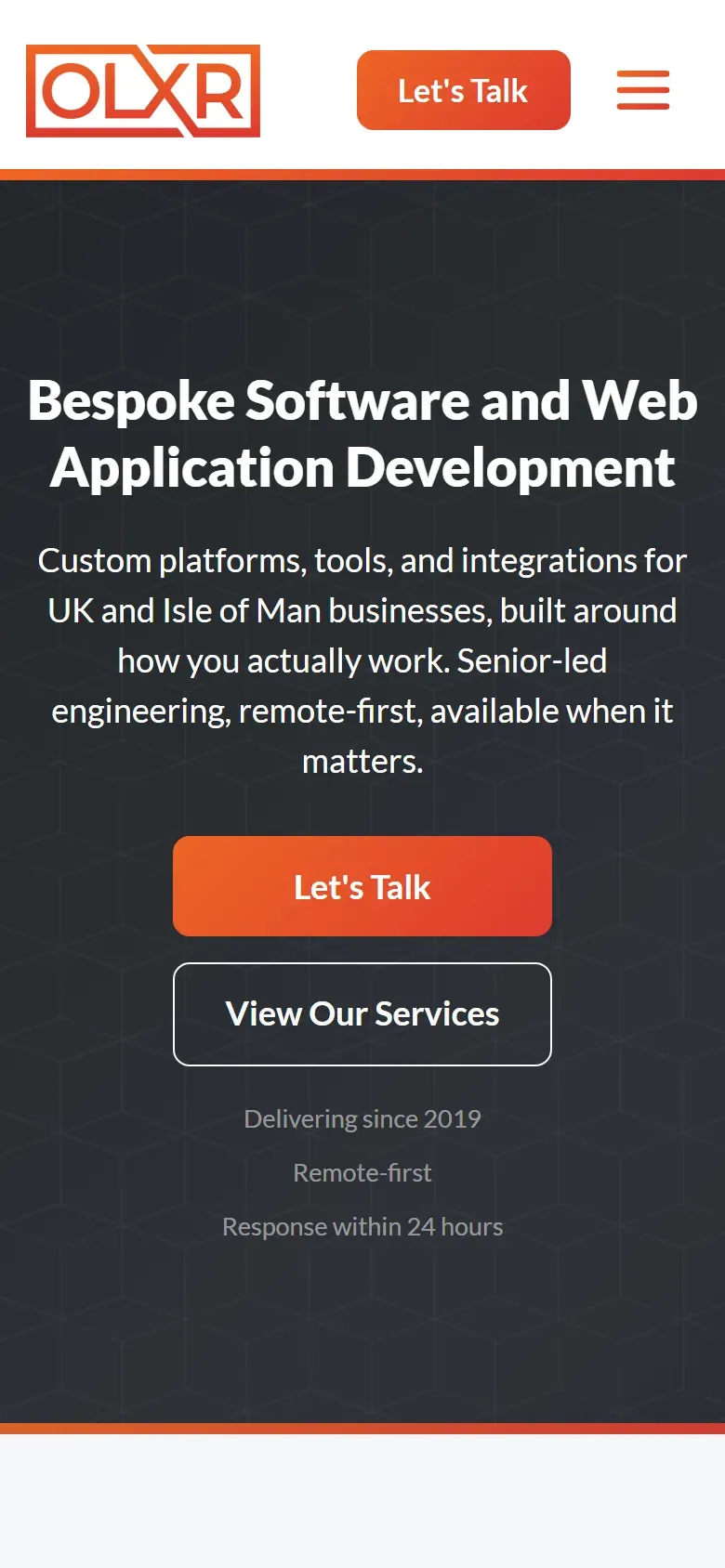
- The headline describes the work, not the result. “Bespoke Software and Web Application Development” tells a developer what you do. A business owner wants to know what changes for them - fewer hours in spreadsheets, a website that brings in work.
- The language is written for other developers. “Senior-led engineering”, “remote-first”, “fractional CTO” and a list of programming languages and databases mean little to most of the people who'd hire you.
- The menus offer too much choice. The Services menu alone has around 30 links, and Industries adds another dozen. Faced with that many options, most people pick none.
- Websites are hard to find. The managed website service - Presence - sits under Products and in one card halfway down the homepage, so someone who came for a website may not realise you build them.
- Two separate website products - Presence for professional firms and Frontage for estate agents - make it harder to understand what's on offer.
Being found on Google
The technical groundwork is in good shape; the words it targets are the weaker part.
- Done properly: each page checked has its own title and description, a canonical address (so Google doesn't count duplicates), and sharing previews for LinkedIn, Facebook and X.
- A Google Business Profile is linked from the footer, which helps with local searches.
- The homepage title targets software only - “Bespoke Software & Web Application Development, UK”. Nobody searching for a website on the Isle of Man would see it as a match, and the island isn't mentioned in it at all.
- The description uses jargon - “fractional CTO consultancy” is a phrase very few small business owners search for.
Speed on a phone
Measured on mobile with Google's own PageSpeed Insights. This is the best part of the site - there is nothing here that needs fixing.
| Measure | Score | What it means |
|---|---|---|
| Performance | How quickly the page loads on mobile data | |
| Accessibility | How usable it is for everyone, including screen readers | |
| Best practices | Security and modern standards | |
| SEO | How easily Google can read it |
Google counts anything from 90 as good, so all four are in the band. The nine points missing from performance aren't worth chasing until the wording and the structure are sorted out - they'd win a fraction of a second, where the headline is costing visitors.
Housekeeping
Mostly tidy, with a few promises that don't quite match.
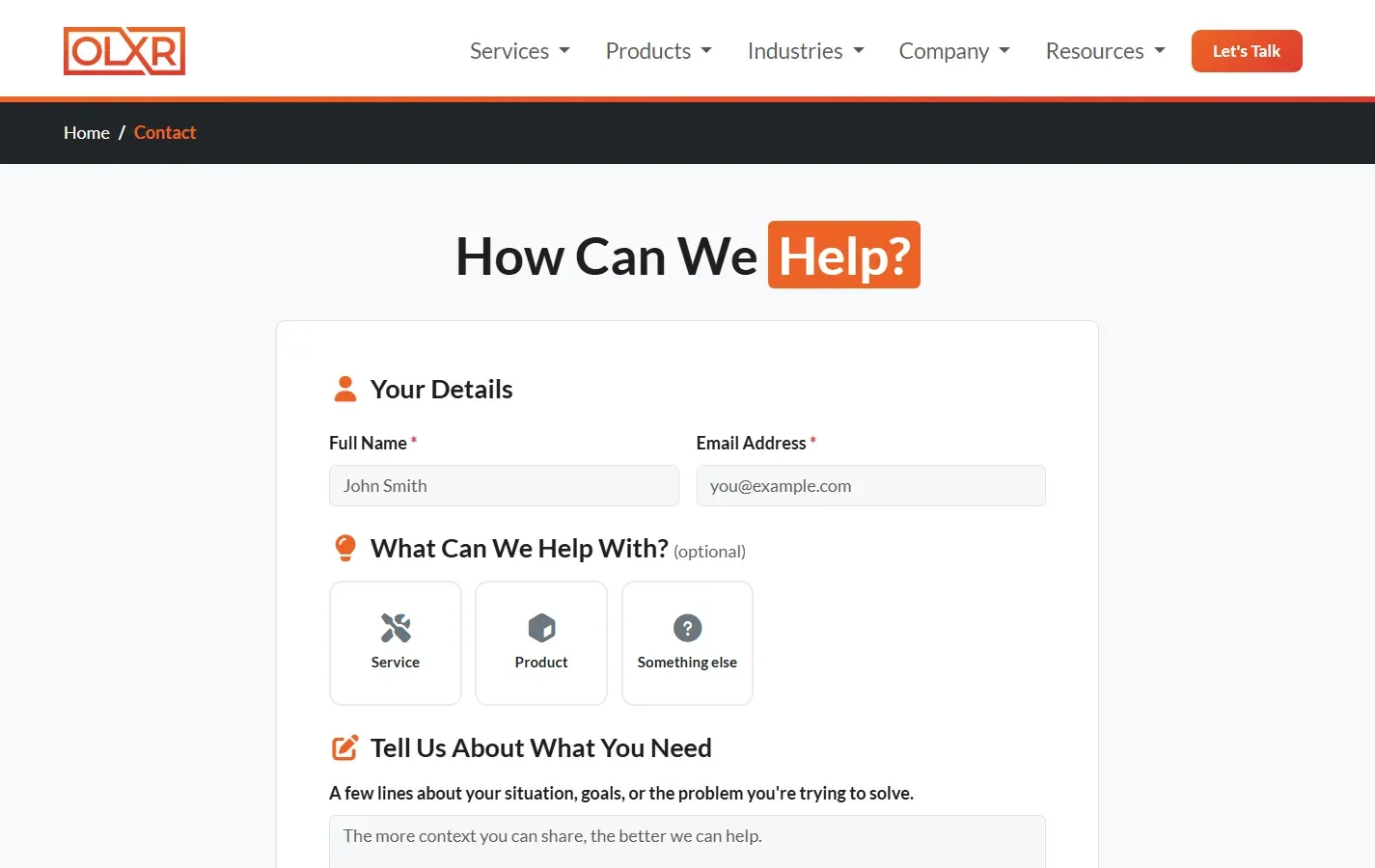
- The contact form is good - short, with a privacy policy link and a clear message when it's sent. Email and WhatsApp are offered as alternatives.
- Response times don't agree. The homepage says “response within 24 hours”, while the contact page's description says “within one working day”. Pick one and use it everywhere.
- The free call is described two ways - a “free consultation” on the homepage and a “free 30-minute scoping call” on the contact page.
- A Careers link in the footer suggests a team that's hiring, which sits oddly with a one-person business.
- The email address is hidden behind a spam filter, so it only appears once the page has fully loaded - in some email apps and readers it shows as “[email protected]” instead.
Content and trust
The credentials are strong; the voice and the proof undercut them.
- The testimonials have no names. “Managing Director, E-Gaming Firm” and “Financial Services Client” read as genuine, but without a name or company, a sceptical visitor can't tell. Even a first name and an industry would help.
- “We” or “I”? The site speaks as “we” and “our team”, then promises “you'll speak directly with Owen”. Being one person is your biggest selling point - the site should say “I” throughout.
- The AWS certification is a strong trust signal and links to a page that verifies it - worth keeping prominent.
- Recent articles show the business is active, including an honest account of passing the AWS exam - the kind of writing that builds trust.
Suggestions
In order of what will make the biggest difference first.
- Rewrite the homepage headline around what the visitor gets, in plain English
- Cut the menus to a handful of links - websites, software, work, about, contact
- Make websites easy to find from the top of the homepage
- Write in the first person (“I”) throughout
- Add names, or at least first names and industries, to testimonials
- Settle on one response time and one name for the free call
- Add “Isle of Man” and websites to the homepage title and description
- Remove the Careers link unless you're hiring
Next steps
Most of the list above is wording and structure rather than code, so it's a few days' work - and it's what the new OLXR site is being built to fix.
The suggestions are yours to act on with anyone. If you'd like help with any of them, reply to the email this came with.